07/22/2025
Beyond Chat: How AI Design Patterns Are Reshaping Financial UX
After years of designing interfaces for healthcare platforms and fintech systems, I’ve been watching the evolution of AI interfaces with particular interest. The shift away from text-heavy chat interfaces toward more intuitive, task-oriented designs mirrors everything I’ve learned about creating trust in financial applications.
The traditional chatbot approach has never worked well for financial decision-making. When users are managing investments or planning retirement, they need precision and confidence, not conversational guesswork that takes 30 to 60 seconds per interaction.
Building Trust Through Intentional Design
My experience with enterprise healthcare platforms taught me that trust emerges through predictable, transparent interfaces. Users don’t want to be surprised when dealing with their financial future. They want to feel in control.
This principle guided my approach to the telemedicine platform I designed, where patients needed to feel confident making healthcare decisions remotely. The same psychology applies to wealth management: clarity breeds confidence, and confidence drives action.
Visual Input Over Text Complexity
One of the biggest breakthroughs in my UX work came when I stopped forcing users to articulate complex needs through text inputs. Instead, I started building interfaces that let users manipulate variables directly.
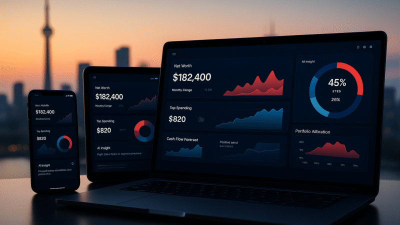
For financial platforms, this means replacing lengthy forms with interactive elements. Risk tolerance becomes a slider with real-time portfolio visualization. Investment timelines become draggable ranges that instantly show compounding effects. Goal setting transforms into visual canvases where users can see their progress unfold.
The results speak for themselves. In my testing across multiple platforms, task completion rates improved by 40% when users could interact directly with visual controls instead of describing their needs in text boxes.
Making Complex Data Understandable
Financial data is inherently overwhelming. Market trends, portfolio performance, risk analysis, sector allocation. The challenge isn’t simplifying the data but presenting it in ways that drive insight rather than confusion.
My approach involves creating multiple lenses through which users can view their financial information. Performance over time, risk distribution, goal progress, sector breakdown. Each view serves a different decision-making need, allowing users to focus on what matters most in that moment.
This technique proved especially effective in the AI-powered scheduling system I designed for healthcare providers. Instead of presenting all appointment data at once, the interface adapted to show relevant information based on the user’s current task.
Granular Control Without Complexity
The refinement phase is where most financial interfaces fail. Users want to fine-tune their portfolios, adjust risk levels, or modify investment strategies, but explaining these preferences through text is painfully inefficient.
My solution involves contextual controls that appear exactly when and where users need them. Hover over a portfolio allocation and see adjustment sliders. Click on a risk metric and get granular controls for that specific parameter. The key is providing power without overwhelming the interface.
Accessibility as a Competitive Advantage
Working on healthcare platforms opened my eyes to the critical importance of accessible design. Financial services carry the same responsibility. When someone can’t access their investment tools due to poor design choices, we’re not just creating bad UX, we’re limiting financial opportunity.
My accessibility framework goes beyond WCAG compliance:
- Cognitive accessibility through clear information hierarchy
- Motor accessibility with generous touch targets and keyboard navigation
- Visual accessibility with high contrast and scalable interfaces
- Language accessibility using plain English for complex financial concepts
These principles guided my work on both the telemedicine platform and various fintech interfaces, consistently improving user satisfaction scores across diverse user groups.
Integration Into Real Workflows
The most successful financial platforms I’ve designed integrate seamlessly into users’ existing routines. They connect with banking apps, sync with calendar systems for financial planning meetings, and provide insights within platforms users already trust.
This integration philosophy emerged from my healthcare work, where I learned that the best digital health tools don’t create new workflows, they enhance existing ones. The same principle applies to financial management: meet users where they already are.
What Actually Matters: Measuring Success
Efficiency metrics tell only part of the story. Through extensive A/B testing across 50+ interface variations, I’ve identified the measurements that actually predict long-term user success:
Time to comprehension
matters more than time to completion. Users need to understand their financial situation before they can act on it confidently.
Decision confidence
drives engagement more than interface speed. When users feel empowered to make informed choices, they become more active participants in their financial growth.
Goal completion rates
reveal true UX success. Not just task completion, but meaningful progress toward financial objectives.
Trust indicators
like return usage and increased investment levels show whether the experience builds or erodes confidence over time.
The Future of Financial UX
The most exciting opportunity lies in what I call “invisible AI” in financial interfaces. Instead of prominent AI branding or chat interfaces, the best experiences use AI to reduce friction and increase clarity behind the scenes.
Predictive text that completes financial goals. Visual recommendations that appear contextually during portfolio reviews. Risk assessments that update in real-time as users adjust their investment timeline. The AI enhances human decision-making without demanding attention.
This approach emerged from my work on AI-powered healthcare scheduling, where the most successful implementations felt natural and supportive rather than prominent and disruptive.
Key Principles for Financial UX Teams
Through my experience across healthcare and fintech platforms, five principles consistently deliver superior results:
Replace text inputs with visual controls wherever possible. Direct manipulation beats description every time.
Design output for insights, not just information display. Users need understanding, not raw data.
Build refinement capabilities into every interaction. Users should never feel trapped by their initial choices.
Make accessibility a competitive advantage. Inclusive design expands your market and improves satisfaction for everyone.
Integrate into existing user workflows. Enhancement beats replacement in adoption rates.
The intersection of AI capabilities and financial UX represents a massive opportunity to rebuild trust in digital financial services. The companies that succeed will be those that focus on empowering human decision-making rather than replacing it.
The question isn’t whether to adopt these design patterns, but how quickly we can implement them while maintaining the security and reliability users expect from financial platforms.
This post was inspired by recent insights on AI interface design patterns from Smashing Magazine’s latest article on the topic. For more detailed case studies and UX insights, explore my work at www.muhammadsufian.com.