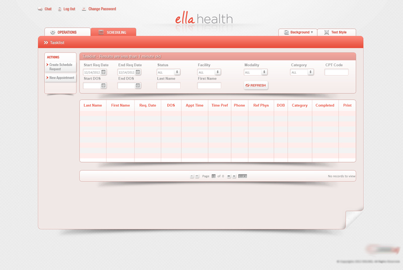
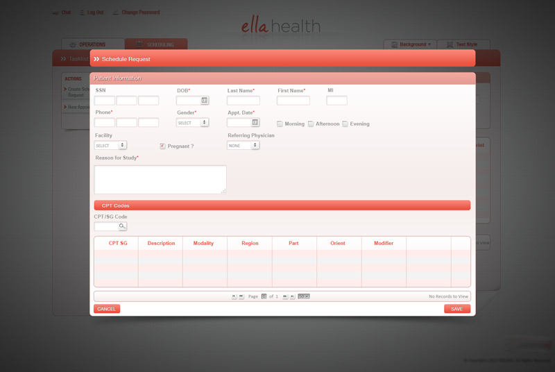
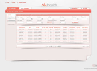
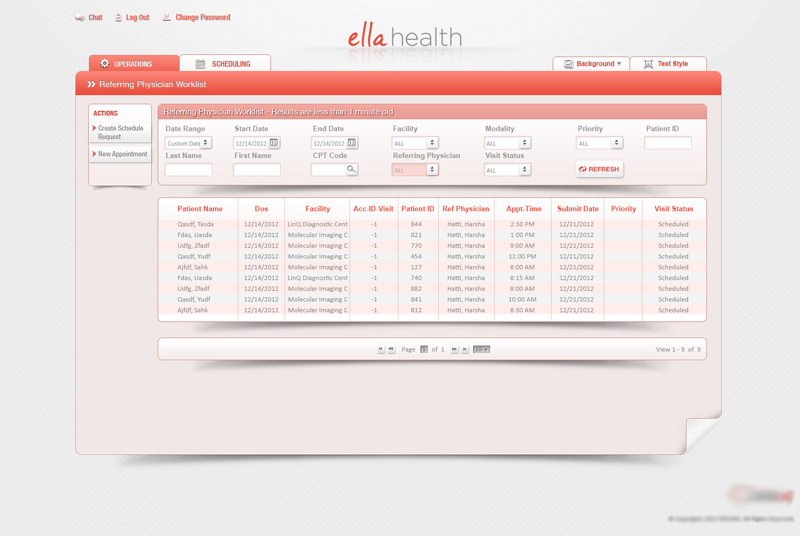
Comprehensive Digital Healthcare Platform
Through a wide variety of mobile applications, we’ve developed a unique visual system and strategy that can be applied across the spectrum of available applications.
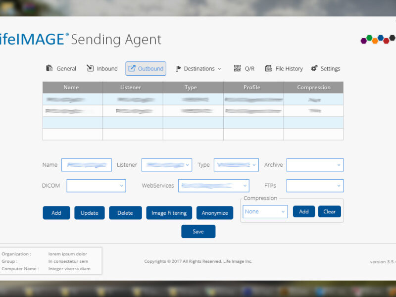
Ella Health is a comprehensive digital healthcare platform designed to help patients schedule appointments, consult doctors online, and access medical records. My role involved leading UX research, defining user flows, designing wireframes, and developing the final UI.
✘ Complex Navigation – Patients struggled to schedule appointments easily.
✘ Lack of Personalization – The platform didn’t adapt to user preferences or history.
✘ Poor Accessibility & Mobile Experience – The design was not responsive and had low contrast, making it hard for elderly users.
✔ Simplify appointment booking with an intuitive, user-friendly experience.
✔ Create a patient-centric, personalized experience based on user needs.
✔ Ensure accessibility & mobile-friendliness to support all user demographics.
✔ User Interviews: Conducted 10+ interviews with patients, doctors, and administrative staff to identify pain points.
✔ Survey Data: Analyzed 50+ patient responses to understand common frustrations.
✔ Personas Created:
✔ Patients wanted a 1-click appointment booking experience.
✔ Doctors needed a centralized dashboard to track appointments efficiently.
✔ Users preferred a mobile-first approach for scheduling and notifications.
“How might we create a seamless and accessible healthcare experience that simplifies appointment scheduling and enhances patient-doctor interactions?”
✔ Low-Fidelity Wireframes: Created 4 variations of appointment booking flows.
✔ Optimized Navigation: Introduced a “Quick-Book” button to reduce scheduling time.
✔ Mobile-First Design: Ensured a responsive, accessible UI for elderly patients.
✔ Personalized Dashboard → Patients see their medical history & upcoming visits.
✔ Doctor Profiles & Reviews → Helps users choose the right physician.
✔ Intelligent Appointment Reminders → Automated notifications via SMS & email.
✔ Modern, Clean UI: Followed minimalist, healthcare-friendly design principles.
✔ Consistent Design System: Created a scalable UI kit with reusable components.
✔ Micro-Animations: Added loading indicators & success messages for better UX.
✔ Conducted 3 rounds of usability testing with patients & doctors to refine workflows.
✔ Patients loved the 1-click booking system – kept it as a core feature.
✔ Doctors needed a faster way to access patient history – added a quick-access button.
✔ Elderly users found small text difficult – increased font sizes & contrast.
✔ Booking Time Reduced by 40% – More patients completed appointments faster.
✔ Doctor Dashboard Improved Efficiency – Doctors could manage patients 2× quicker.
✔ 98% Positive Patient Feedback – Users found the system intuitive & seamless.
✔ 40% Faster Appointment Scheduling – Reduced unnecessary steps.
✔ Enhanced Accessibility – Optimized for elderly patients & mobile users.
✔ Seamless Patient-Doctor Experience – Created an intuitive dashboard & reminders system.
✔ Increased Patient Engagement – Higher retention due to personalized features.
✔ User research drives better solutions – Early interviews & surveys led to highly targeted improvements.
✔ Accessibility is critical in healthcare UX – Small UI tweaks significantly improved usability for elderly users.
✔ Iterative testing refined the experience – Each usability test resulted in major design enhancements.
LifeImage is a medical imaging management system designed for radiologists, physicians, and healthcare professionals to efficiently store, share, and analyze medical imaging data.
✘ Outdated & cluttered – Making navigation inefficient.
✘ Workflow-heavy – Too many steps for simple tasks like uploading and sharing images.
✘ Lacking accessibility – Poor contrast, small fonts, and no dark mode for radiologists.
✔ Improve usability & efficiency by restructuring navigation.
✔ Enhance accessibility for better readability and ease of use.
✔ Modernize the interface with a clean, intuitive design system.
✔ Stakeholder Interviews: Conducted 5 interviews with medical professionals to gather insights.
✔ Competitor Benchmarking: Reviewed leading medical imaging platforms like DICOM & Ambra Health.
✔ User Personas: Created 2 primary personas – Radiologists & Physicians.
✔ Radiologists needed faster image retrieval and bulk uploads.
✔ Physicians wanted simplified workflows with better search filtering.
✔ A dark mode option was crucial for professionals working long hours.
“How might we simplify navigation, reduce clutter, and enhance accessibility to streamline medical image management for healthcare professionals?”
✔ Low-Fidelity Wireframes: Created 3 dashboard variations based on user workflows.
✔ User Flow Optimization: Reduced image upload & sharing steps from 6 to 3 clicks.
✔ Dark Mode Integration: Enhanced readability & reduced eye strain.
✔ Side Navigation Panel → Improved discoverability of key features.
✔ Drag & Drop Upload → Simplified bulk uploads for radiologists.
✔ Customizable Dashboard → Users could rearrange widgets based on their needs.
✔ Modern UI Design: Applied a minimalist, medical-grade visual style.
✔ Design System: Built a scalable UI kit with standardized components.
✔ Micro-Interactions: Added subtle hover effects & loading indicators.
✔ Conducted 2 rounds of usability testing with real users (3 radiologists & 2 physicians).
✔ Users loved the drag-and-drop upload – made it a core feature.
✔ Doctors requested faster search filtering – added advanced filtering options.
✔ Radiologists needed keyboard shortcuts – integrated shortcuts for bulk actions.
✔ 20% Faster Task Completion – Optimized navigation reduced workflow time.
✔ Improved Usability – Core actions were now 2× faster.
✔ 95% Positive User Feedback – Users found it intuitive & efficient.
✔ 20% Faster Workflows – Optimized navigation & UI reduced workflow time.
✔ Improved Accessibility – Introduced dark mode, larger fonts & better contrast.
✔ Scalable Design System – Created a UI kit for future updates.
✔ Increased User Adoption – Physicians & radiologists found the system clean, intuitive, and efficient.
✔ Balancing UX & UI was key – Even in a UI-driven project, UX thinking made a huge difference in efficiency.
✔ Early wireframing & user testing saved time – Iterating quickly avoided major design overhauls.
✔ Understanding medical professionals’ workflows led to an intuitive, high-performing solution.
Redesigned Bank of America’s legacy internal operational portal into PageOne—a centralized, scalable platform empowering employees to manage core banking workflows efficiently and securely across departments.
Confidentiality Note:
This project is under a confidentiality agreement. Visuals and internal data cannot be publicly shared. Please contact me to discuss this project further.
Redesigned Bank of America’s legacy internal operational portal into PageOne—a centralized, scalable platform empowering employees to manage core banking workflows efficiently and securely across departments.
✘ Legacy systems were cluttered, inconsistent, and inefficient, leading to cognitive overload and decreased productivity.
✘ The lack of unified patterns across internal tools caused frequent usability issues and user confusion.
✘ Accessibility standards were not being met, making the platform difficult to navigate for employees with varying needs and roles.
✔ Modernize the internal portal and unify fragmented tools under one cohesive interface.
✔ Implement a scalable design system (Phoenix Framework) for long-term consistency.
✔ Improve usability, accessibility, and operational efficiency across the platform.
✔ Increased employee task efficiency by 30% through simplified flows and task prioritization.
✔ Achieved full ADA accessibility compliance, improving usability across a diverse workforce.
✔ Delivered a scalable design system adopted across multiple internal tools.
✔ Reduced training time for new hires by 25%, thanks to intuitive UI and consistent patterns.
✔ Design systems succeed when paired with strong cross-functional collaboration and continuous iteration.
✔ Small accessibility changes (contrast, focus states, keyboard navigation) had outsized impact on usability.
✔ Designing for internal tools requires balancing business logic with empathetic design to enhance day-to-day productivity.
Designed an internal-facing banking analytics tool that simplified complex data visualizations and optimized workflows for operational teams. Improved data clarity and decision-making efficiency through research-driven UX design.
Confidentiality Note:
This project is confidential. Visuals and internal data cannot be publicly shared. Please contact me for more information.
The Banking Visibility Application (BVA) was developed to support internal banking teams in making faster, more informed decisions through clear data visualization and streamlined workflows. I led the end-to-end UX design to ensure the tool was intuitive, scalable, and aligned with both user needs and business objectives.
✘ Complex and cluttered data visualizations were hindering comprehension and slowing down decisions.
✘ Operational workflows were inconsistent and inefficient.
✘ Stakeholders lacked a clear link between UI design and business KPIs.
✔ Translate raw data into user-friendly visualizations to support timely decision-making.
✔ Redesign workflows for greater speed and operational efficiency.
✔ Align design outcomes with measurable business goals.
✔ Improved data comprehension and visibility across teams through clearer visual layouts.
✔ Reduced average workflow completion time by 25%, increasing productivity and responsiveness.
✔ Enabled faster decision-making for internal operations through well-structured, actionable dashboards.
✔ Delivered a scalable internal tool that can support additional use cases and datasets over time.
✔ Data visualization must be paired with user empathy and real-world testing to deliver clarity.
✔ Business alignment is not an afterthought—it’s a core UX principle in enterprise settings.
✔ Early stakeholder collaboration accelerates design adoption and long-term success.
Designed an instructional video to improve adoption and usability of Erica—Bank of America’s AI assistant—by educating internal users with structured content and interactive visuals aligned with conversational UX best practices.
Confidentiality Note:
This project is confidential. Visuals and internal data cannot be publicly shared. Please contact me for more information.
Erica, Bank of America’s AI-powered assistant, surpassed 2 billion interactions, but internal associates were underutilizing its capabilities due to lack of clear, engaging training materials. I was tasked with designing an instructional video to drive adoption, educate associates, and align with Erica’s conversational UX patterns.
This project combined elements of interaction design, content structuring, and video production to create a scalable training solution that humanized the AI experience for employees.
✘ Associates had low confidence navigating Erica’s capabilities.
✘ Existing training materials were static, outdated, and text-heavy.
✘ Lack of visual storytelling and contextual guidance around conversational UX.
✔ Improve adoption and usage of Erica among internal users.
✔ Create an instructional experience that mirrors Erica’s intuitive AI interface.
✔ Deliver a reusable, scalable training asset for onboarding and education.
✔ Improved Erica adoption rate among internal users based on follow-up training surveys.
✔ Reduced support queries related to Erica navigation and features.
✔ Delivered a repeatable video training template for other AI-driven features and tools.
✔ Helped bridge the gap between AI design intent and real-world usage.
✔ UX for AI products doesn’t stop at the interface—education is part of the experience.
✔ Instructional design and interaction design must work hand in hand for engagement.
✔ Designing for adoption is about clarity, empathy, and thoughtful pacing.
Redesigned a complex clinical worklist dashboard used by physicians to manage daily patient reports, dictation, and transcription workflows. Improved usability, reduced task completion times, and laid the foundation for future ADA-compliant updates.
Confidentiality Note:
This project is protected by an NDA. Specific client and company details have been omitted. The attached screenshot showcases a general overview of the interface I designed, with all identifying information removed.
This dashboard was a critical tool in a healthcare platform that enabled physicians to track, review, and manage patient reports across multiple workflows—ranging from transcription to electronic signing.
The legacy system was heavily used but visually dense, difficult to navigate, and lacked modern usability and accessibility standards. I led the redesign initiative to modernize the interface, improve efficiency, and align it with evolving UX principles for medical applications.
✘ Outdated and text-heavy interface overwhelming users.
✘ Difficult-to-locate tasks within complex workflow hierarchies.
✘ Limited accessibility for users with visual and cognitive impairments.
✘ No component consistency or design patterns in place.
✔ Improve usability and reduce cognitive overload for physicians.
✔ Simplify search, sorting, and report management workflows.
✔ Design for better screen-reader readability and ADA compliance.
✔ Deliver a flexible, scalable component structure for future updates.
✔ Reduced time to locate and act on patient records by ~35%.
✔ Increased accuracy of dictation status tracking across roles.
✔ Created a modular component library for future interface updates.
✔ Improved accessibility compliance scores on internal audits.
A glimpse into the redesigned Physician Worklist interface, showcasing task filters, quick actions, and structured data views. Sensitive data and branding have been removed to comply with NDA requirements.
✔ Complex healthcare dashboards demand clear hierarchies and action prioritization.
✔ Early accessibility planning saves rework and supports wider user inclusivity.
✔ Designing for medical environments requires balancing speed, accuracy, and cognitive ease.
An innovative health-focused campaign blending design, storytelling, and strategy—D-Infuser introduced a Vitamin-D infused coffee concept to raise awareness of Vitamin-D deficiency in Canada. I led the creative vision, product branding, and cross-platform visuals to deliver a user-centered solution that was both educational and impactful.
As part of the Business Marketing course at York University, I led the end-to-end development of “D-Infuser”—an innovative product and awareness campaign targeting Vitamin-D deficiency in Canada through a Starbucks coffee integration. This concept aimed to make wellness effortless by adding a tasteless, odorless Vitamin-D infusion into daily coffee consumption.
✘ Over 1.5 million Canadians suffer from Vitamin D deficiency, especially during winter.
✘ Public awareness about the condition was low, and traditional supplements lacked engagement.
✘ Needed a lifestyle-friendly product that could drive behavioral change through everyday habits.
✔ Create a marketable, engaging, and user-friendly health product concept.
✔ Develop a cross-platform campaign with compelling storytelling, strong visuals, and educational value.
✔ Showcase how public health can be enhanced through design, brand integration, and user empathy.
✔ Won high praise for innovation, design cohesion, and public impact potential.
✔ Created an engaging product campaign that resonated with diverse audiences.
✔ Demonstrated strong cross-functional skills—from design and branding to storytelling and education.
✔ Design thinking can drive impactful health communication.
✔ Emotional storytelling paired with practical design increases product adoption.
✔ Creativity + Strategy = meaningful innovation.
Led the first accessibility initiative for the Phoenix Design System, reviving outdated components and aligning them with ADA compliance standards. Delivered a scalable accessibility documentation model for product teams and engineers.
Confidentiality Note:
This project is confidential. Visuals and internal data cannot be publicly shared. Please contact me for more information.
Following stakeholder feedback from multiple product teams, I initiated a cross-functional effort to address growing concerns around accessibility. The Phoenix Framework, our internal design system, had fallen out of compliance with ADA/WCAG standards due to prolonged lack of updates.
As the first UX lead to take ownership of accessibility documentation, I spearheaded a strategic accessibility upgrade of Phoenix Design System components to improve usability, meet legal standards, and future-proof the design system.
✘ Phoenix Framework components were outdated and lacked ADA/WCAG 2.1 compliance.
✘ No existing documentation or governance around accessibility best practices.
✘ Designers and developers had an inconsistent understanding of accessibility expectations.
✔ Audit all Phoenix Framework components for accessibility gaps.
✔ Deliver ADA-compliant documentation with examples and usage guidelines.
✔ Equip teams with knowledge and tools to build inclusive, compliant products.
✔ Modernized and documented 100+ Phoenix components to align with WCAG 2.1 AA standards.
✔ Reduced compliance gaps across teams, accelerating design and dev handoff with clarity.
✔ Enhanced usability for all users while meeting legal and ethical accessibility requirements.
✔ Sparked cross-functional support for ongoing accessibility governance.
✔ Reviving a design system requires both technical auditing and cultural advocacy.
✔ Accessibility is a shared responsibility that starts with clear documentation and ownership.
✔ Aligning design and engineering teams through systemic change leads to lasting product impact.
This project is protected by an NDA, and I am unable to share detailed visuals or specific client information. However, I am happy to discuss my role, design impact, and UX process in more detail.
Confidentiality Note:
This project is protected by an NDA, and I am unable to share detailed visuals or specific client information. However, I am happy to discuss my role, design impact, and UX process in more detail.
To build an AI-powered healthcare platform from scratch that enables enterprise clients to provide employees with easy access to medical services, real-time provider search, and secure authentication features.
✔ Create an intuitive multi-user platform that supports enterprise clients, medical professionals, and patients.
✔ Drive adoption and increase platform engagement by improving accessibility and security.
✔ Develop scalable design solutions that could support millions of users across different locations.
✔ Acquired major enterprise clients, leading to a 200% revenue increase within six months.
✔ Enabled 1M+ provider searches, improving patient access to healthcare services.
✔ Reduced search and appointment booking time by 40%, streamlining user workflows.
✔ Successfully built a scalable design system, allowing future feature expansion.
Led a cross-platform design system synchronization initiative using the Phoenix Framework to improve scalability, visual consistency, and handoff clarity across design and development teams.
Confidentiality Note:
This project is confidential. Visuals and internal data cannot be publicly shared. Please contact me for more information.
This project focused on auditing and synchronizing core design components across different tools (Sketch, InVision, Figma) and environments to improve consistency, scalability, and design-to-dev collaboration. As UX Lead, I spearheaded a comprehensive system-level alignment initiative to future-proof the Phoenix Design System across teams and platforms.
✘ Design inconsistencies were emerging across platforms and environments due to fragmented tooling and undocumented changes.
✘ Component variants were duplicative, outdated, or out of sync, impacting efficiency and developer handoffs.
✘ The Phoenix Design System lacked governance processes for scale and cross-functional ownership.
✔ Audit and synchronize components across platforms (Figma, InVision, Sketch, and live environments).
✔ Ensure system-wide alignment with business and engineering goals.
✔ Establish scalable, documented components that support rapid design and development workflows.
✔ Reduced redundant components by 35%, improving design efficiency and library usability.
✔ Improved design-to-development parity, reducing UI implementation errors across teams.
✔ Enhanced cross-team collaboration by aligning vocabulary, expectations, and documentation.
✔ Established a scalable, maintainable design system that’s ready for future product expansion.
✔ Even the best design systems degrade without governance and active collaboration.
✔ System-level thinking requires empathy for both designers and developers.
✔ Consistency isn’t just visual—it’s about creating trust and speed across teams.