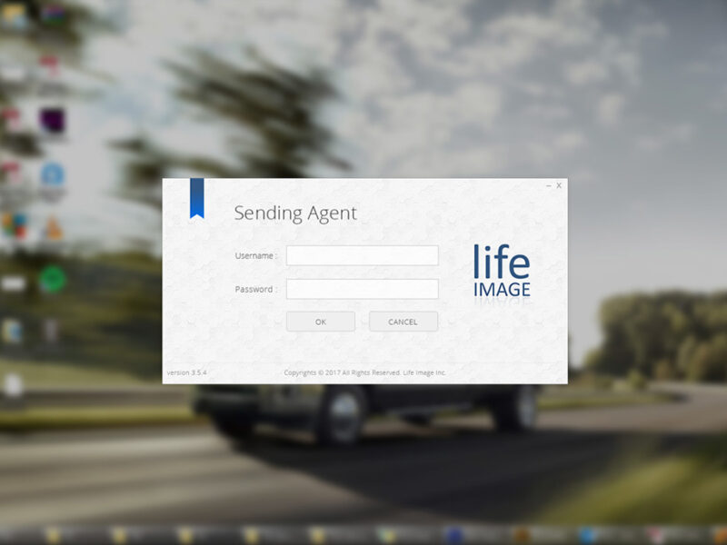
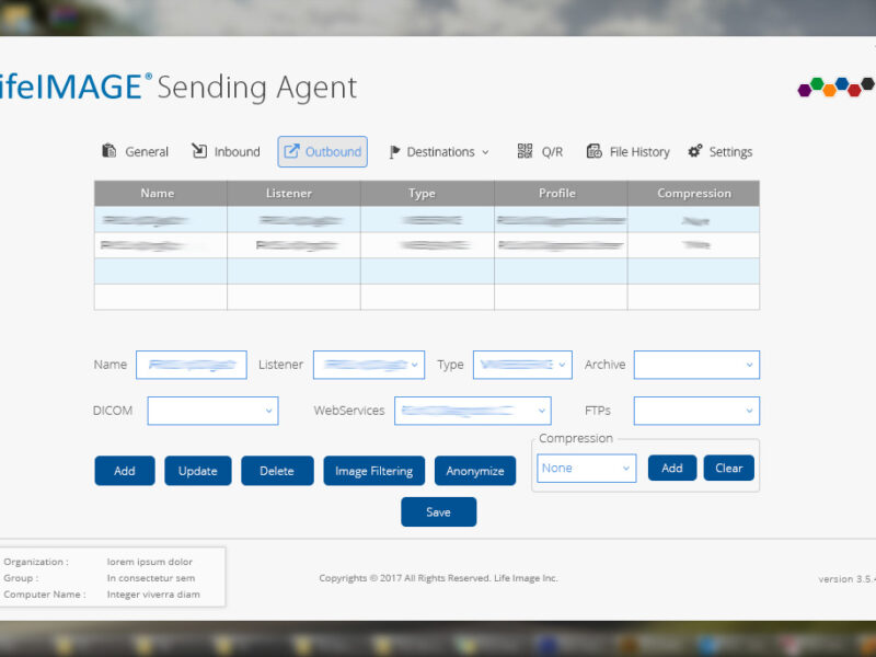
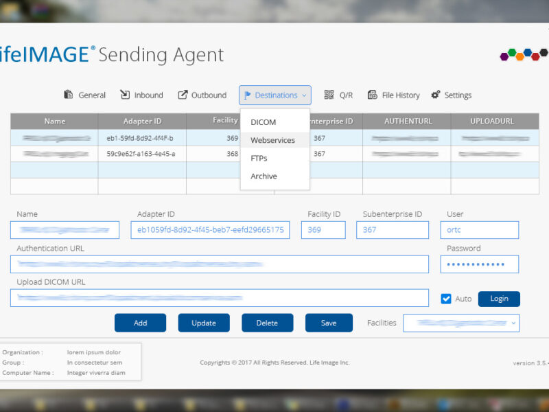
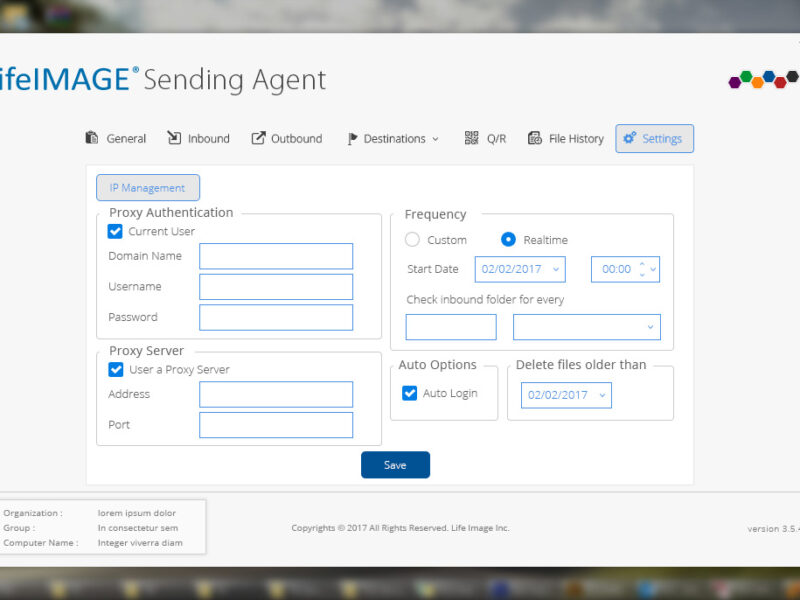
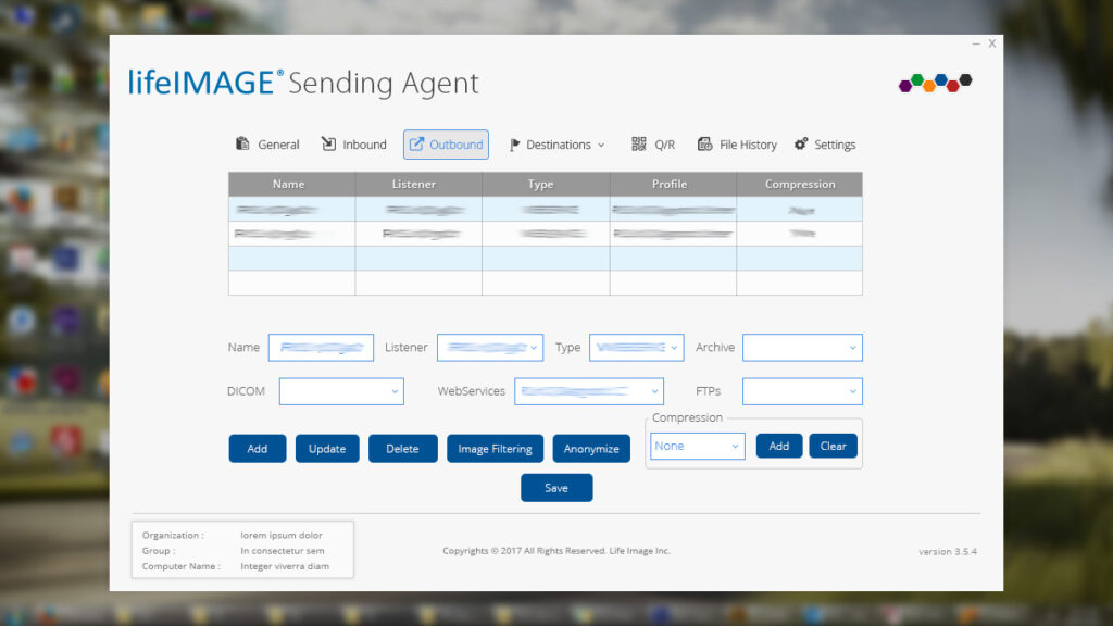
LifeImage is a medical imaging management system designed for radiologists, physicians, and healthcare professionals to efficiently store, share, and analyze medical imaging data.
Project TypeWeb & Mobile UI/UX Design for a Medical Image Management Platform
My RoleSenior UX Designer (Lead UI/UX Design, Research, Prototyping, Testing)
LifeImage is a medical imaging management system designed for radiologists, physicians, and healthcare professionals to efficiently store, share, and analyze medical imaging data.
The Challenge
✘ Outdated & cluttered – Making navigation inefficient. ✘ Workflow-heavy – Too many steps for simple tasks like uploading and sharing images. ✘ Lacking accessibility – Poor contrast, small fonts, and no dark mode for radiologists.
The Goal
✔ Improve usability & efficiency by restructuring navigation. ✔ Enhance accessibility for better readability and ease of use. ✔ Modernize the interface with a clean, intuitive design system.
1. UX Process: My Approach
Research & Understanding the Users
✔ Stakeholder Interviews: Conducted 5 interviews with medical professionals to gather insights. ✔ Competitor Benchmarking: Reviewed leading medical imaging platforms like DICOM & Ambra Health. ✔ User Personas: Created 2 primary personas – Radiologists & Physicians.
Key Findings from Research
✔ Radiologists needed faster image retrieval and bulk uploads. ✔ Physicians wanted simplified workflows with better search filtering. ✔ A dark mode option was crucial for professionals working long hours.
2. Defining the Problem
Problem Statement:
“How might we simplify navigation, reduce clutter, and enhance accessibility to streamline medical image management for healthcare professionals?”
3. Wireframing & Prototyping
✔ Low-Fidelity Wireframes: Created 3 dashboard variations based on user workflows. ✔ User Flow Optimization: Reduced image upload & sharing steps from 6 to 3 clicks. ✔ Dark Mode Integration: Enhanced readability & reduced eye strain.
Key UX Improvements:
✔ Side Navigation Panel → Improved discoverability of key features. ✔ Drag & Drop Upload → Simplified bulk uploads for radiologists. ✔ Customizable Dashboard → Users could rearrange widgets based on their needs.
✔ Modern UI Design: Applied a minimalist, medical-grade visual style. ✔ Design System: Built a scalable UI kit with standardized components. ✔ Micro-Interactions: Added subtle hover effects & loading indicators.
5. Usability Testing & Iterations
✔ Conducted 2 rounds of usability testing with real users (3 radiologists & 2 physicians).
Key Feedback & Iterations
✔ Users loved the drag-and-drop upload – made it a core feature. ✔ Doctors requested faster search filtering – added advanced filtering options. ✔ Radiologists needed keyboard shortcuts – integrated shortcuts for bulk actions.
Final Iteration Outcome:
✔ 20% Faster Task Completion – Optimized navigation reduced workflow time. ✔ Improved Usability – Core actions were now 2× faster. ✔ 95% Positive User Feedback – Users found it intuitive & efficient.
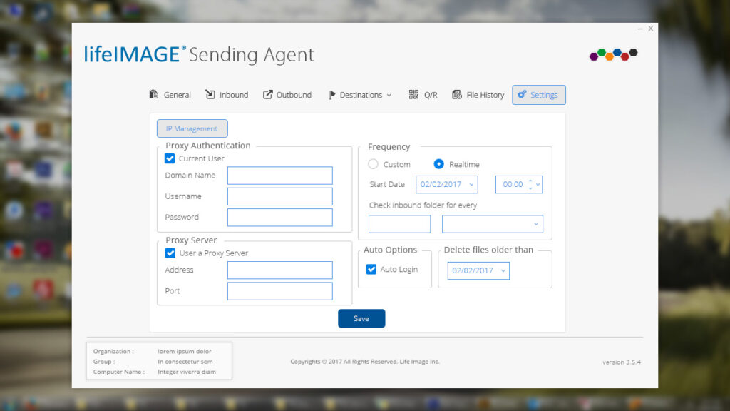
OutboundSettings
Final Outcome & Impact
✔ 20% Faster Workflows – Optimized navigation & UI reduced workflow time. ✔ Improved Accessibility – Introduced dark mode, larger fonts & better contrast. ✔ Scalable Design System – Created a UI kit for future updates. ✔ Increased User Adoption – Physicians & radiologists found the system clean, intuitive, and efficient.
Key Takeaways & Learnings
✔ Balancing UX & UI was key – Even in a UI-driven project, UX thinking made a huge difference in efficiency. ✔ Early wireframing & user testing saved time – Iterating quickly avoided major design overhauls. ✔ Understanding medical professionals’ workflows led to an intuitive, high-performing solution.
Redesigned Bank of America’s legacy internal operational portal into PageOne—a centralized, scalable platform empowering employees to manage core banking workflows efficiently and securely across departments.
This project is under a confidentiality agreement. Visuals and internal data cannot be publicly shared. Please contact me to discuss this project further.
Redesigned Bank of America’s legacy internal operational portal into PageOne—a centralized, scalable platform empowering employees to manage core banking workflows efficiently and securely across departments.
The Challenge
✘ Legacy systems were cluttered, inconsistent, and inefficient, leading to cognitive overload and decreased productivity. ✘ The lack of unified patterns across internal tools caused frequent usability issues and user confusion. ✘ Accessibility standards were not being met, making the platform difficult to navigate for employees with varying needs and roles.
The Goal
✔ Modernize the internal portal and unify fragmented tools under one cohesive interface. ✔ Implement a scalable design system (Phoenix Framework) for long-term consistency. ✔ Improve usability, accessibility, and operational efficiency across the platform.
My UX Process & Approach
Research & User Understanding
Led stakeholder interviews and conducted contextual inquiry across different departments to uncover bottlenecks.
Ran heuristic evaluations, user surveys, and synthesized feedback into actionable insights.
Developed personas and journey maps to guide design decisions and prioritize features based on user roles (tellers, managers, support staff).
Information Architecture & Prototyping
Reorganized IA to reflect more intuitive workflows based on task frequency and user needs.
Created low-fidelity wireframes to validate layout and interactions early with internal stakeholders.
Built high-fidelity prototypes in Figma and InVision, tailored for specific roles within the bank.
Design System Integration (Phoenix Framework)
Collaborated with engineers and accessibility teams to integrate the Phoenix Design System.
Customized components for internal use cases, ensuring scalability and consistency.
Documented component usage patterns for future product teams.
Usability Testing & Iteration
Facilitated usability testing with real employees using task-based scenarios.
Measured task success rates, time-on-task, and satisfaction scores pre- and post-redesign.
Iteratively improved flows and visual hierarchy based on data and accessibility feedback.
Final Outcome & Impact
✔ Increased employee task efficiency by 30% through simplified flows and task prioritization. ✔ Achieved full ADA accessibility compliance, improving usability across a diverse workforce. ✔ Delivered a scalable design system adopted across multiple internal tools. ✔ Reduced training time for new hires by 25%, thanks to intuitive UI and consistent patterns.
Key Takeaways & Learnings
✔ Design systems succeed when paired with strong cross-functional collaboration and continuous iteration. ✔ Small accessibility changes (contrast, focus states, keyboard navigation) had outsized impact on usability. ✔ Designing for internal tools requires balancing business logic with empathetic design to enhance day-to-day productivity.
Designed an internal-facing banking analytics tool that simplified complex data visualizations and optimized workflows for operational teams. Improved data clarity and decision-making efficiency through research-driven UX design.
Project TypeEnterprise SaaS, Data Visualization UX, FinTech, Internal Tool Design, UX Research & Workflow Optimization
My RoleUX Designer (Research, Wireframing, Prototyping, Testing)
Tools UsedFigma, InVision, Sketch, Phoenix Design System
This project is confidential. Visuals and internal data cannot be publicly shared. Please contact me for more information.
The Banking Visibility Application (BVA) was developed to support internal banking teams in making faster, more informed decisions through clear data visualization and streamlined workflows. I led the end-to-end UX design to ensure the tool was intuitive, scalable, and aligned with both user needs and business objectives.
The Challenge
✘ Complex and cluttered data visualizations were hindering comprehension and slowing down decisions. ✘ Operational workflows were inconsistent and inefficient. ✘ Stakeholders lacked a clear link between UI design and business KPIs.
The Goal
✔ Translate raw data into user-friendly visualizations to support timely decision-making. ✔ Redesign workflows for greater speed and operational efficiency. ✔ Align design outcomes with measurable business goals.
My UX Process & Approach
Research & User Understanding
Conducted user interviews and stakeholder workshops to understand pain points and expectations.
Mapped existing workflows and identified bottlenecks across departments.
Synthesized findings into personas and task flows to guide ideation.
Wireframing & Prototyping
Created low-fidelity wireframes to explore layout and data hierarchy.
Designed high-fidelity prototypes with interactive dashboards tailored to user roles.
Prioritized modular design for potential reuse and scalability across teams.
Design System Integration (Phoenix Framework)
Utilized the Phoenix Design System to maintain visual consistency and scalability across the application.
Customized components for dashboard-specific needs including filters, charts, and user role variations.
Partnered with developers to ensure component behavior matched interaction expectations across breakpoints.
Documented usage guidelines for future design iterations and system expansion.
Usability Testing & Iteration
Facilitated testing sessions with internal analysts and operational leads.
Gathered feedback on clarity, speed of access, and interaction flows.
Iterated on visual hierarchy, filters, and navigation to reduce friction and cognitive load.
Final Outcome & Impact
✔ Improved data comprehension and visibility across teams through clearer visual layouts. ✔ Reduced average workflow completion time by 25%, increasing productivity and responsiveness. ✔ Enabled faster decision-making for internal operations through well-structured, actionable dashboards. ✔ Delivered a scalable internal tool that can support additional use cases and datasets over time.
Key Takeaways & Learnings
✔ Data visualization must be paired with user empathy and real-world testing to deliver clarity. ✔ Business alignment is not an afterthought—it’s a core UX principle in enterprise settings. ✔ Early stakeholder collaboration accelerates design adoption and long-term success.
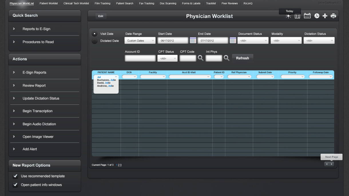
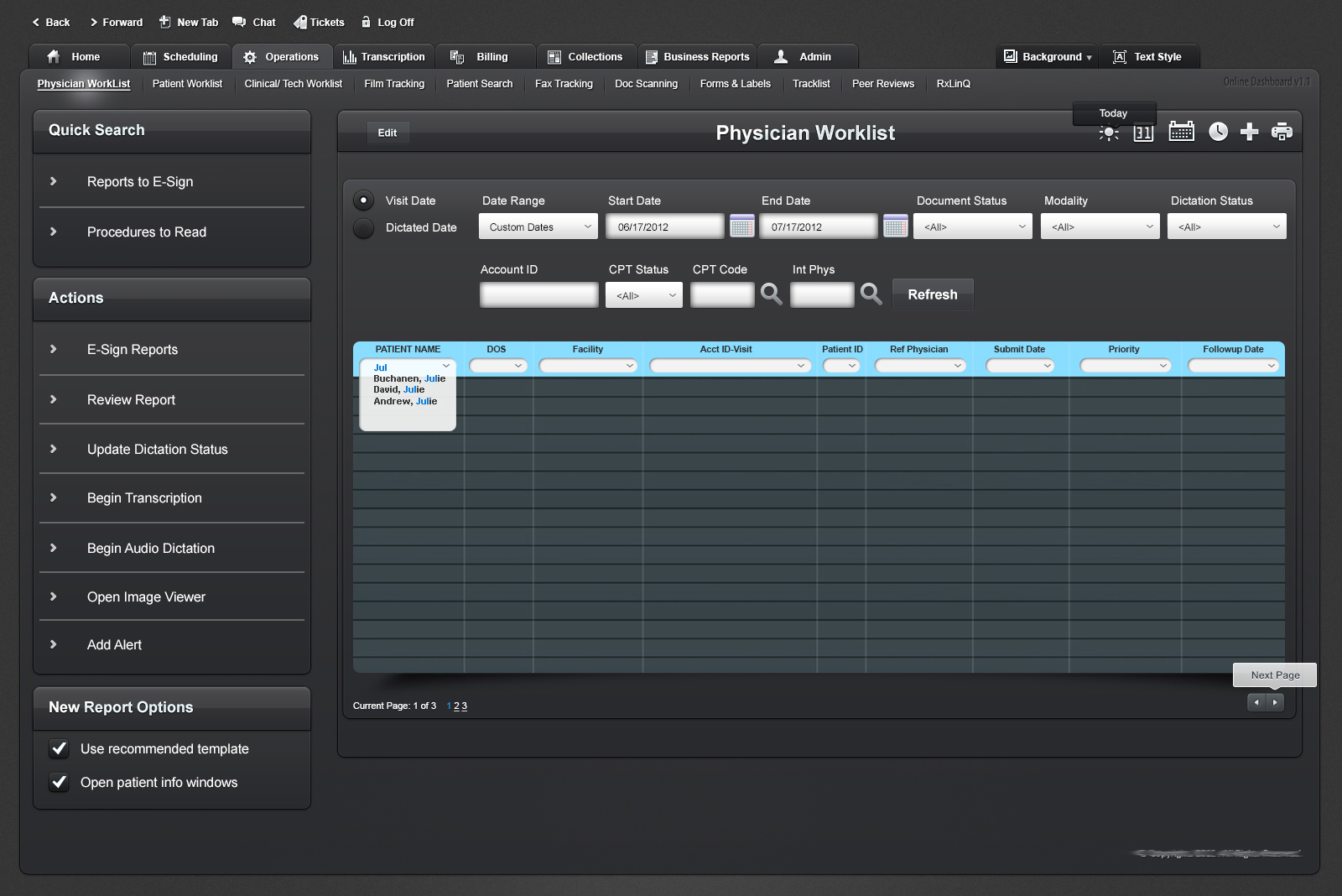
Redesigned a complex clinical worklist dashboard used by physicians to manage daily patient reports, dictation, and transcription workflows. Improved usability, reduced task completion times, and laid the foundation for future ADA-compliant updates.
This project is protected by an NDA. Specific client and company details have been omitted. The attached screenshot showcases a general overview of the interface I designed, with all identifying information removed.
This dashboard was a critical tool in a healthcare platform that enabled physicians to track, review, and manage patient reports across multiple workflows—ranging from transcription to electronic signing.
The legacy system was heavily used but visually dense, difficult to navigate, and lacked modern usability and accessibility standards. I led the redesign initiative to modernize the interface, improve efficiency, and align it with evolving UX principles for medical applications.
The Challenge
✘ Outdated and text-heavy interface overwhelming users. ✘ Difficult-to-locate tasks within complex workflow hierarchies. ✘ Limited accessibility for users with visual and cognitive impairments. ✘ No component consistency or design patterns in place.
The Goal
✔ Improve usability and reduce cognitive overload for physicians. ✔ Simplify search, sorting, and report management workflows. ✔ Design for better screen-reader readability and ADA compliance. ✔ Deliver a flexible, scalable component structure for future updates.
My UX Process & Approach
Discovery & Research
Conducted user interviews with medical staff to map pain points in report processing.
Analyzed real usage patterns and prioritized high-frequency tasks.
Audited the existing interface for visual hierarchy, interaction clarity, and accessibility.
Wireframing & Prototyping
Used Balsamiq and Axure RP to wireframe early versions of the dashboard.
Introduced tabbed navigation, action panels, and dynamic data sorting/filtering.
Mapped out focus states and screen reader labels in early mockups.
UI Design & Accessibility Improvements
Created clean UI layouts in Adobe Photoshop and Illustrator based on medical-grade visual principles.
Improved color contrast, type size, and interactive affordances.
Designed tooltip patterns and tab flow for easier keyboard navigation.
Collaboration & Testing
Worked closely with developers and QA to ensure fidelity of interaction patterns.
Gathered iterative feedback from physicians and transcriptionists.
Partnered with compliance advisors to prepare groundwork for full ADA accessibility rollout.
Final Outcome & Impact
✔ Reduced time to locate and act on patient records by ~35%. ✔ Increased accuracy of dictation status tracking across roles. ✔ Created a modular component library for future interface updates. ✔ Improved accessibility compliance scores on internal audits.
A glimpse into the redesigned Physician Worklist interface, showcasing task filters, quick actions, and structured data views. Sensitive data and branding have been removed to comply with NDA requirements.
Key Takeaways & Learnings
✔ Complex healthcare dashboards demand clear hierarchies and action prioritization. ✔ Early accessibility planning saves rework and supports wider user inclusivity. ✔ Designing for medical environments requires balancing speed, accuracy, and cognitive ease.
Led a cross-platform design system synchronization initiative using the Phoenix Framework to improve scalability, visual consistency, and handoff clarity across design and development teams.
This project is confidential. Visuals and internal data cannot be publicly shared. Please contact me for more information.
This project focused on auditing and synchronizing core design components across different tools (Sketch, InVision, Figma) and environments to improve consistency, scalability, and design-to-dev collaboration. As UX Lead, I spearheaded a comprehensive system-level alignment initiative to future-proof the Phoenix Design System across teams and platforms.
The Challenge
✘ Design inconsistencies were emerging across platforms and environments due to fragmented tooling and undocumented changes. ✘ Component variants were duplicative, outdated, or out of sync, impacting efficiency and developer handoffs. ✘ The Phoenix Design System lacked governance processes for scale and cross-functional ownership.
The Goal
✔ Audit and synchronize components across platforms (Figma, InVision, Sketch, and live environments). ✔ Ensure system-wide alignment with business and engineering goals. ✔ Establish scalable, documented components that support rapid design and development workflows.
My UX Process & Approach
Research & Component Auditing
Conducted a full audit of design components across design libraries, live code, and internal tools.
Mapped inconsistencies in naming, spacing, color usage, and interactions.
Documented system gaps and areas of overlap to inform consolidation strategy.
Cross-Functional Collaboration
Facilitated workshops with developers, PMs, and designers to identify friction points and sync component usage.
Created a shared alignment map of component states, variants, and intended use cases.
Worked with QA to map visual differences between code and design artifacts.
System Integration & Governance
Updated and streamlined Phoenix Design System components in Figma, ensuring 1:1 parity with codebase versions.
Created documentation templates and usage guidelines to reduce future divergence.
Established governance rituals (reviews, audits, documentation standards) to maintain quality and consistency.
Final Outcome & Impact
✔ Reduced redundant components by 35%, improving design efficiency and library usability. ✔ Improved design-to-development parity, reducing UI implementation errors across teams. ✔ Enhanced cross-team collaboration by aligning vocabulary, expectations, and documentation. ✔ Established a scalable, maintainable design system that’s ready for future product expansion.
Key Takeaways & Learnings
✔ Even the best design systems degrade without governance and active collaboration. ✔ System-level thinking requires empathy for both designers and developers. ✔ Consistency isn’t just visual—it’s about creating trust and speed across teams.