Through a wide variety of mobile applications, we’ve developed a unique visual system and strategy that can be applied across the spectrum of available applications.
Ella Health is a comprehensive digital healthcare platform designed to help patients schedule appointments, consult doctors online, and access medical records. My role involved leading UX research, defining user flows, designing wireframes, and developing the final UI.
The Challenge
✘ Complex Navigation – Patients struggled to schedule appointments easily. ✘ Lack of Personalization – The platform didn’t adapt to user preferences or history. ✘ Poor Accessibility & Mobile Experience – The design was not responsive and had low contrast, making it hard for elderly users.
The Goal
✔ Simplify appointment booking with an intuitive, user-friendly experience. ✔ Create a patient-centric, personalized experience based on user needs. ✔ Ensure accessibility & mobile-friendliness to support all user demographics.
1. UX Process: My Approach
Research & User Understanding
✔ User Interviews: Conducted 10+ interviews with patients, doctors, and administrative staff to identify pain points. ✔ Survey Data: Analyzed 50+ patient responses to understand common frustrations. ✔ Personas Created:
Secondary Persona:Dr. John (Physician, Age 50) – Needs a simple dashboard to manage patients.
Key Insights from Research
✔ Patients wanted a 1-click appointment booking experience. ✔ Doctors needed a centralized dashboard to track appointments efficiently. ✔ Users preferred a mobile-first approach for scheduling and notifications.
2. Defining the Problem
Problem Statement:
“How might we create a seamless and accessible healthcare experience that simplifies appointment scheduling and enhances patient-doctor interactions?”
3. Wireframing & Prototyping
✔ Low-Fidelity Wireframes: Created 4 variations of appointment booking flows. ✔ Optimized Navigation: Introduced a “Quick-Book” button to reduce scheduling time. ✔ Mobile-First Design: Ensured a responsive, accessible UI for elderly patients.
Key UX Improvements:
✔ Personalized Dashboard → Patients see their medical history & upcoming visits. ✔ Doctor Profiles & Reviews → Helps users choose the right physician. ✔ Intelligent Appointment Reminders → Automated notifications via SMS & email.
✔ Modern, Clean UI: Followed minimalist, healthcare-friendly design principles. ✔ Consistent Design System: Created a scalable UI kit with reusable components. ✔ Micro-Animations: Added loading indicators & success messages for better UX.
5. Usability Testing & Iterations
✔ Conducted 3 rounds of usability testing with patients & doctors to refine workflows.
Key Feedback & Iterations
✔ Patients loved the 1-click booking system – kept it as a core feature. ✔ Doctors needed a faster way to access patient history – added a quick-access button. ✔ Elderly users found small text difficult – increased font sizes & contrast.
Final Iteration Outcome:
✔ Booking Time Reduced by 40% – More patients completed appointments faster. ✔ Doctor Dashboard Improved Efficiency – Doctors could manage patients 2× quicker. ✔ 98% Positive Patient Feedback – Users found the system intuitive & seamless.
Final Outcome & Impact
✔ 40% Faster Appointment Scheduling – Reduced unnecessary steps. ✔ Enhanced Accessibility – Optimized for elderly patients & mobile users. ✔ Seamless Patient-Doctor Experience – Created an intuitive dashboard & reminders system. ✔ Increased Patient Engagement – Higher retention due to personalized features.
Key Takeaways & Learnings
✔ User research drives better solutions – Early interviews & surveys led to highly targeted improvements. ✔ Accessibility is critical in healthcare UX – Small UI tweaks significantly improved usability for elderly users. ✔ Iterative testing refined the experience – Each usability test resulted in major design enhancements.
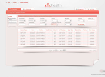
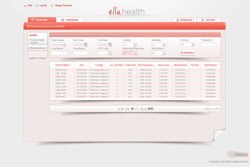
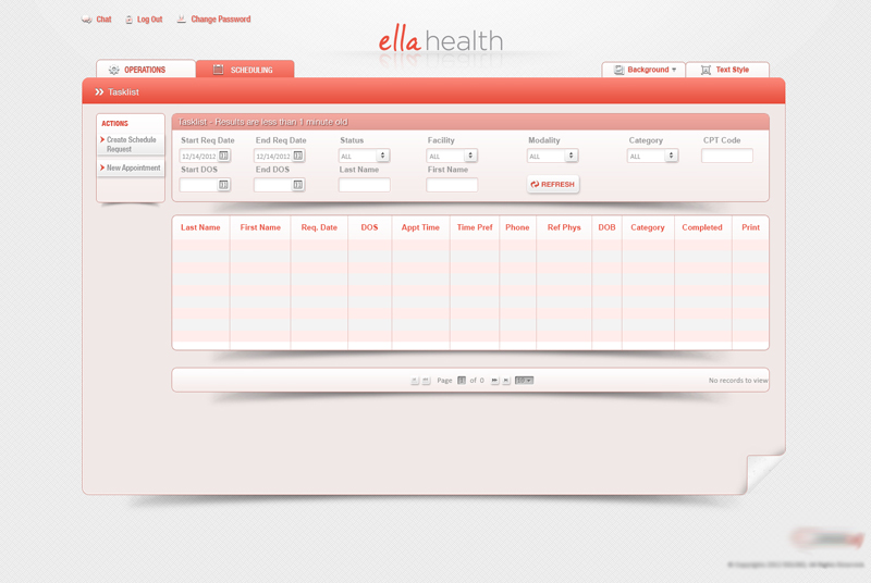
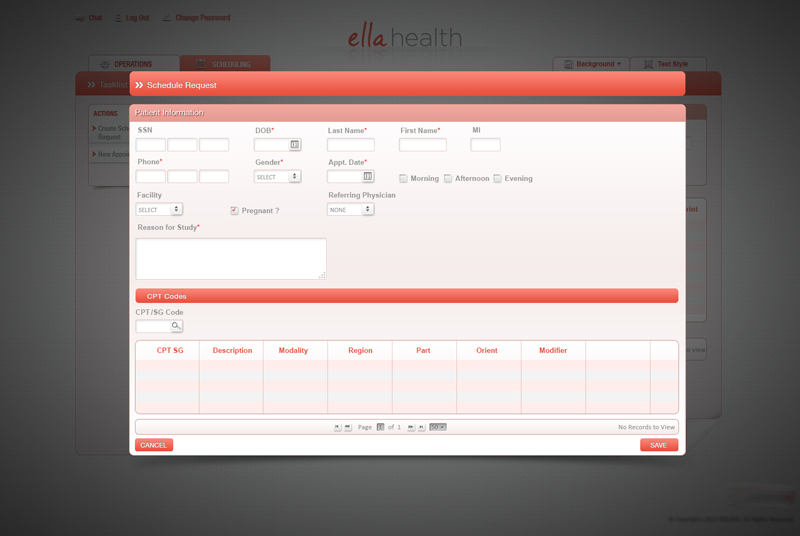
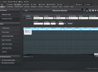
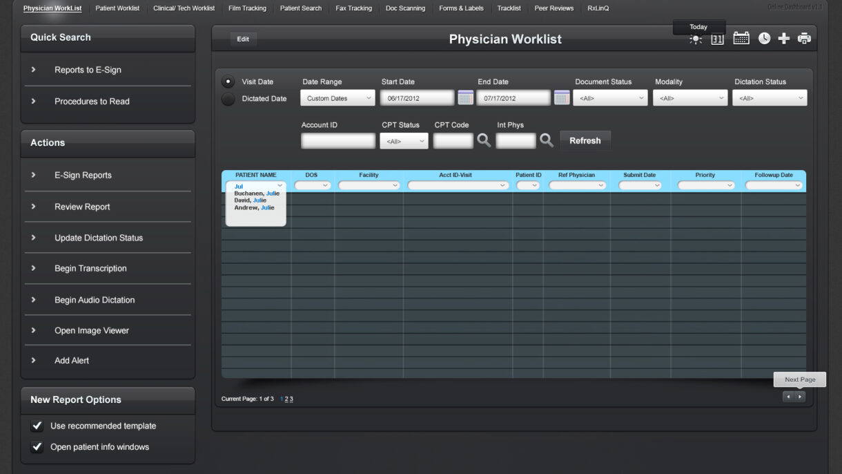
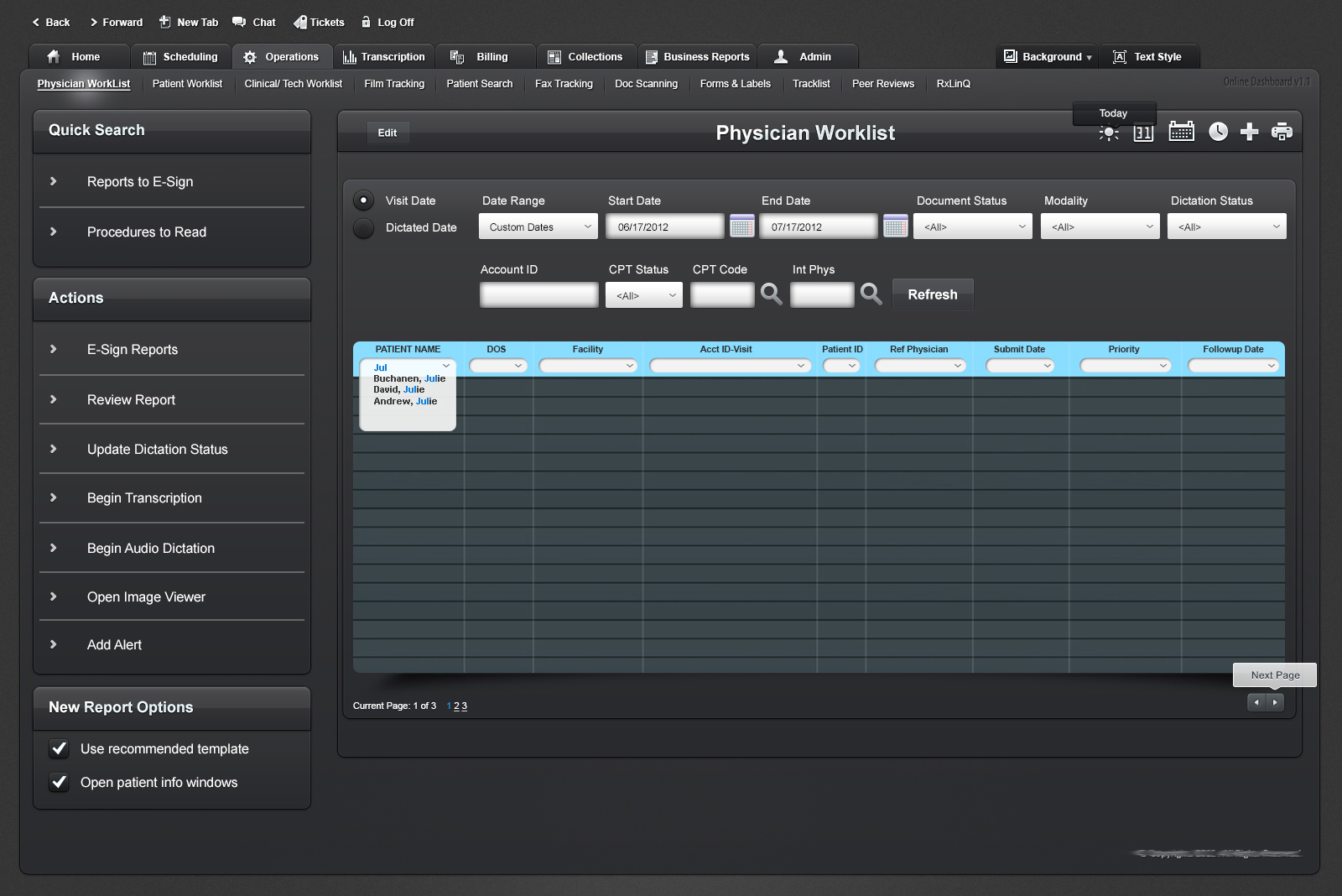
Redesigned a complex clinical worklist dashboard used by physicians to manage daily patient reports, dictation, and transcription workflows. Improved usability, reduced task completion times, and laid the foundation for future ADA-compliant updates.
This project is protected by an NDA. Specific client and company details have been omitted. The attached screenshot showcases a general overview of the interface I designed, with all identifying information removed.
This dashboard was a critical tool in a healthcare platform that enabled physicians to track, review, and manage patient reports across multiple workflows—ranging from transcription to electronic signing.
The legacy system was heavily used but visually dense, difficult to navigate, and lacked modern usability and accessibility standards. I led the redesign initiative to modernize the interface, improve efficiency, and align it with evolving UX principles for medical applications.
The Challenge
✘ Outdated and text-heavy interface overwhelming users. ✘ Difficult-to-locate tasks within complex workflow hierarchies. ✘ Limited accessibility for users with visual and cognitive impairments. ✘ No component consistency or design patterns in place.
The Goal
✔ Improve usability and reduce cognitive overload for physicians. ✔ Simplify search, sorting, and report management workflows. ✔ Design for better screen-reader readability and ADA compliance. ✔ Deliver a flexible, scalable component structure for future updates.
My UX Process & Approach
Discovery & Research
Conducted user interviews with medical staff to map pain points in report processing.
Analyzed real usage patterns and prioritized high-frequency tasks.
Audited the existing interface for visual hierarchy, interaction clarity, and accessibility.
Wireframing & Prototyping
Used Balsamiq and Axure RP to wireframe early versions of the dashboard.
Introduced tabbed navigation, action panels, and dynamic data sorting/filtering.
Mapped out focus states and screen reader labels in early mockups.
UI Design & Accessibility Improvements
Created clean UI layouts in Adobe Photoshop and Illustrator based on medical-grade visual principles.
Improved color contrast, type size, and interactive affordances.
Designed tooltip patterns and tab flow for easier keyboard navigation.
Collaboration & Testing
Worked closely with developers and QA to ensure fidelity of interaction patterns.
Gathered iterative feedback from physicians and transcriptionists.
Partnered with compliance advisors to prepare groundwork for full ADA accessibility rollout.
Final Outcome & Impact
✔ Reduced time to locate and act on patient records by ~35%. ✔ Increased accuracy of dictation status tracking across roles. ✔ Created a modular component library for future interface updates. ✔ Improved accessibility compliance scores on internal audits.
A glimpse into the redesigned Physician Worklist interface, showcasing task filters, quick actions, and structured data views. Sensitive data and branding have been removed to comply with NDA requirements.
Key Takeaways & Learnings
✔ Complex healthcare dashboards demand clear hierarchies and action prioritization. ✔ Early accessibility planning saves rework and supports wider user inclusivity. ✔ Designing for medical environments requires balancing speed, accuracy, and cognitive ease.
This project is protected by an NDA, and I am unable to share detailed visuals or specific client information. However, I am happy to discuss my role, design impact, and UX process in more detail.
Project TypeB2B Enterprise SaaS, Healthcare UX, AI-Driven Platform, Multi-User System Design, UX Research & Strategy, Location-Based Experience
This project is protected by an NDA, and I am unable to share detailed visuals or specific client information. However, I am happy to discuss my role, design impact, and UX process in more detail.
The Challenge
To build an AI-powered healthcare platform from scratch that enables enterprise clients to provide employees with easy access to medical services, real-time provider search, and secure authentication features.
The Goal
✔ Create an intuitive multi-user platform that supports enterprise clients, medical professionals, and patients. ✔ Drive adoption and increase platform engagement by improving accessibility and security. ✔ Develop scalable design solutions that could support millions of users across different locations.
UX Process: My Approach
Research & User Insights
Conducted stakeholder interviews, usability research, and competitive analysis to define user needs.
Mapped customer journeys and service blueprints to optimize workflows and minimize friction.
Wireframing & Prototyping
Created low-fidelity wireframes to explore navigation and task flows.
Developed high-fidelity interactive prototypes for usability testing and stakeholder validation.
Design & Development:
Designed custom online portals with QR authentication, real-time provider search, and personalized dashboards for different user roles.
Ensured accessibility compliance (WCAG 2.1) and mobile responsiveness to support all devices.
Usability Testing & Iterations
Conducted A/B testing and analytics reviews to measure engagement and refine the UX.
✔ Acquired major enterprise clients, leading to a 200% revenue increase within six months. ✔ Enabled 1M+ provider searches, improving patient access to healthcare services. ✔ Reduced search and appointment booking time by 40%, streamlining user workflows. ✔ Successfully built a scalable design system, allowing future feature expansion.