

Medical Imaging Platform
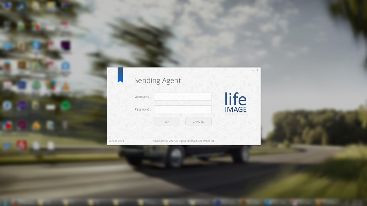
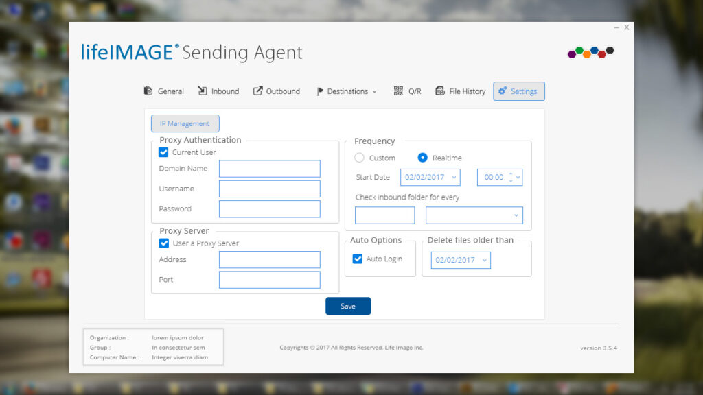
LifeImage is a medical imaging management system designed for radiologists, physicians, and healthcare professionals to efficiently store, share, and analyze medical imaging data.
- Project Type Web & Mobile UI/UX Design for a Medical Image Management Platform
- My Role Senior UX Designer (Lead UI/UX Design, Research, Prototyping, Testing)
- Tools Used Figma, Adobe XD, Sketch, InVision
- Duration 4 Months
- Company Ex3gen Inc. (Client Project)
LifeImage is a medical imaging management system designed for radiologists, physicians, and healthcare professionals to efficiently store, share, and analyze medical imaging data.
The Challenge
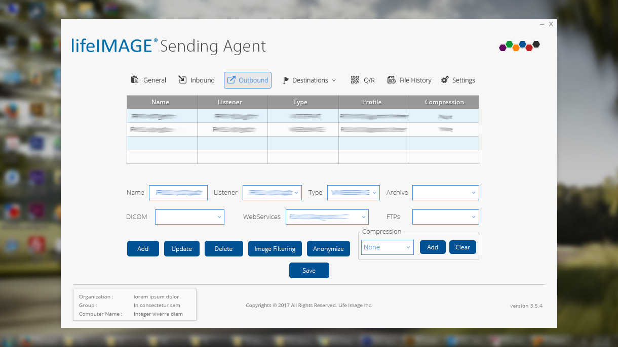
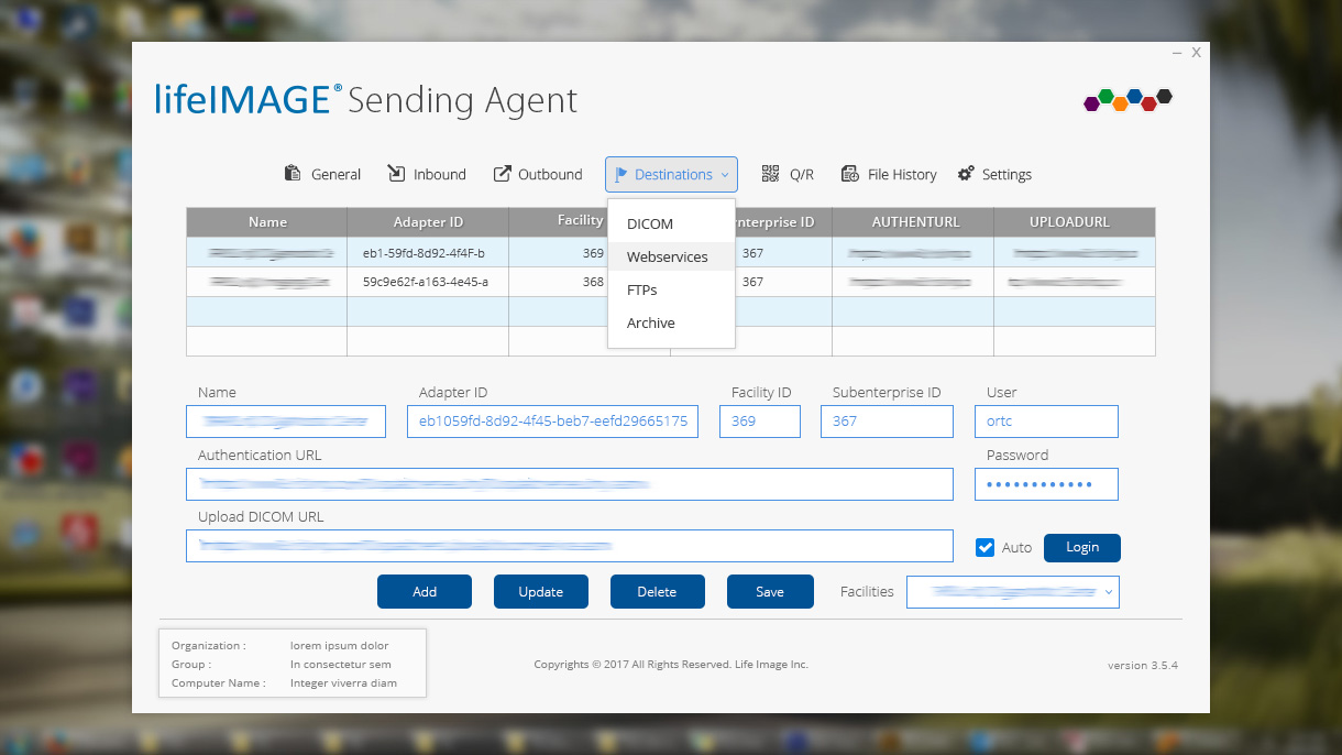
✘ Outdated & cluttered – Making navigation inefficient.
✘ Workflow-heavy – Too many steps for simple tasks like uploading and sharing images.
✘ Lacking accessibility – Poor contrast, small fonts, and no dark mode for radiologists.
The Goal
✔ Improve usability & efficiency by restructuring navigation.
✔ Enhance accessibility for better readability and ease of use.
✔ Modernize the interface with a clean, intuitive design system.
1. UX Process: My Approach
Research & Understanding the Users
✔ Stakeholder Interviews: Conducted 5 interviews with medical professionals to gather insights.
✔ Competitor Benchmarking: Reviewed leading medical imaging platforms like DICOM & Ambra Health.
✔ User Personas: Created 2 primary personas – Radiologists & Physicians.
Key Findings from Research
✔ Radiologists needed faster image retrieval and bulk uploads.
✔ Physicians wanted simplified workflows with better search filtering.
✔ A dark mode option was crucial for professionals working long hours.
2. Defining the Problem
Problem Statement:
“How might we simplify navigation, reduce clutter, and enhance accessibility to streamline medical image management for healthcare professionals?”
3. Wireframing & Prototyping
✔ Low-Fidelity Wireframes: Created 3 dashboard variations based on user workflows.
✔ User Flow Optimization: Reduced image upload & sharing steps from 6 to 3 clicks.
✔ Dark Mode Integration: Enhanced readability & reduced eye strain.
Key UX Improvements:
✔ Side Navigation Panel → Improved discoverability of key features.
✔ Drag & Drop Upload → Simplified bulk uploads for radiologists.
✔ Customizable Dashboard → Users could rearrange widgets based on their needs.
4. High-Fidelity UI Design & Interaction Enhancements
✔ Modern UI Design: Applied a minimalist, medical-grade visual style.
✔ Design System: Built a scalable UI kit with standardized components.
✔ Micro-Interactions: Added subtle hover effects & loading indicators.
5. Usability Testing & Iterations
✔ Conducted 2 rounds of usability testing with real users (3 radiologists & 2 physicians).
Key Feedback & Iterations
✔ Users loved the drag-and-drop upload – made it a core feature.
✔ Doctors requested faster search filtering – added advanced filtering options.
✔ Radiologists needed keyboard shortcuts – integrated shortcuts for bulk actions.
Final Iteration Outcome:
✔ 20% Faster Task Completion – Optimized navigation reduced workflow time.
✔ Improved Usability – Core actions were now 2× faster.
✔ 95% Positive User Feedback – Users found it intuitive & efficient.
Final Outcome & Impact
✔ 20% Faster Workflows – Optimized navigation & UI reduced workflow time.
✔ Improved Accessibility – Introduced dark mode, larger fonts & better contrast.
✔ Scalable Design System – Created a UI kit for future updates.
✔ Increased User Adoption – Physicians & radiologists found the system clean, intuitive, and efficient.
Key Takeaways & Learnings
✔ Balancing UX & UI was key – Even in a UI-driven project, UX thinking made a huge difference in efficiency.
✔ Early wireframing & user testing saved time – Iterating quickly avoided major design overhauls.
✔ Understanding medical professionals’ workflows led to an intuitive, high-performing solution.